Thursday, 16 March 2017

The Secret Diary of Adrian Mole, Aged 13 3/4 - Book cover Analysis


Notes from visit to Waterstones:

  • only one cover design - focusses on Adrians iconic round glasses
  • Typeface is like a typewriter, links to Adrians aspirations to be a writer. 
  • The very minimal design focusses on the writing - like the focus on the diary format of the book
  • glasses drawn in hand style.
  • Simplistic readable spine
  • the book was found in the young teen fiction no child book section
  • children book section is colourful and eye catching
  • complimentary primary, secondary, and tertiary colours.
  • handwritten typeface - friendly, playful and fun, adds character
  • illustration design a still shot from the film, or encapsulates the plot.
  • Most all illustrated by hand drawn style. 
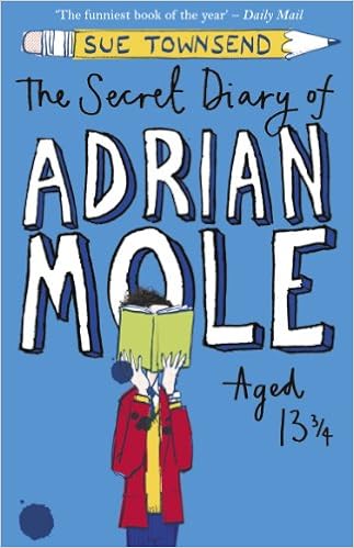
                              Image result for The Secret Diary of Adrian Mole, Aged 13 3/4 book coversImage result for The Secret Diary of Adrian Mole, Aged 13 3/4 book coversImage result for The Secret Diary of Adrian Mole, Aged 13 3/4 book covers

Top Left
  • blue, link to the gender of the main character/narrator
  • hand drawn - playful and fun relating to Adrian characteristics and then way he wrote. 
  • Handwritten style - links to the diary style in which the book is written
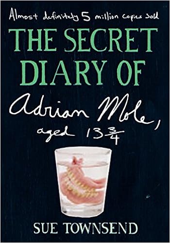
Middle
  • image of false teeth linking to the old man Adrian befriends in narrative
  • Handwritten again to link to the diary - adds a personal touch
  • "almost definitely 5 million copies sold" - comical way of promoting book in the way in which Adiram talks. 
Top Right
  • Movie/Film edition
  • Image of Adrian casted from the film
  • Lined paper design  and handwriting - linking to the diary format to the way its written and Adrian's aspiration to be an intellectual writer. 
All of the books share handwritten typefaces and links to the way in which the books written in a diary format and links to how Adrian is an aspiring writer. The overall look is formal and playful and inviting to younger readers. 

Tuesday, 14 March 2017

To Kill a Mockingbird - Book Cover Analysis

Related image

"To Kill a Mockingbird," featuring a cover design by Shirley Smith, was published by J.B. Lippincott & Co. on July 11, 1960. This design focuses of the iconic oak tree where mysteriously toys and gifts for Scout and Jem appear. The way in which it is positioned has the trunk merge with the spine of the book, possibly representing the oak tree being one of the backbones for of symbolisses of the story. The burgundy red background colour used is rich and represents the wet red soil in Monroeville. The typeface used is handwritten, showing the originality and old stle of the first addition, could represent how the plot and how it's inspired from Harper Lee's childhood.


To get a better understanding of how to approach this brief, I went to Waterstones to look at existing copies and designs of 'To Kill a Mockingbird'. All three designs use of form of symbolism to capture a key point from the film:

Scout playing on her tyre swing - represents the youth of the main protagonist and narrator, could symbolise the coming of age aspect of the book and the way in which Scout is surrounded by the injustice of Monroeville. 

The Mockingbird - The symbol of innocence and purity, the bird Scout and Jem are told not to shoot because it doesn't eat any of the plants and just produces song. The mockingbird is personified in both characters Tom and Boo.
The middle book (top right) has a bird drawn like a child, this could relate to the innocence and youth of Scout.

The use of orange is used in all three books and mostly all of the other book on the shelf, similar to yellow this colour could represent the form of warmth and adventure and enthusiasm. However with the harsh brightness of the orange merging closer to the colour red than yellow, the colour could symbolise a form of warning, intensity and hostility.

The typefaces used are all varied both serif, san serif, and handwritten. The handwritten style like Smith's design possibly links to the idea of how the book references parts of Lee's life. The serif typeface offers a more serious and sophisticated look, with no form of character, the typeface could be viewed as a respectful choice, as the book itself approaches conflicting and racial topics. If the middle book were to have used a handwritten styled typeface this would link to the hand drawn drawing of the mockingbird, possibly too much making the overall book look like a child's book, and not represent the seriousness of the plot summary. The use of black and white for the design could also link to the racial injustice in the book. 

All the books surrounded The Mockingbird Books share:
  • A bold readable title
  • A bright colour (attracts reader)
  • Shares a form of symbolism relating to the narrative of the book
  • Poetic cover design
  • silhouettes/imagery of the main character